All work

Redesigning a Wellness App

Role
Lead UX/UI Designer, Research
Client
Dooable Health
Scope
UX audit and redesign
Platform
Web app and mobile
Dooable logo, a pink speech bubble with a lowercase d above the word dooable and the tagline Good for your health, over a faded photo of a person doing yoga on rocks.

Intro

Dooable Health is a team of nationally board-certified health coaches who seek to help companies and individuals achieve their health goals.

The Dooable health app is an integrated tool that complements the coaching provided by the Dooable health staff. It's a platform for recording health behavior progress, as well as a means of communication with the coach. The app also contains extensive lessons on eating, movement, and living well.

Dooable found their customers had challenges navigating their existing web app and wanted to improve the user experience and overall design of their client-facing interface. CrossComm was tasked with performing a UI/UX audit on the existing app, then designing a new user experience that better serves the goals and functions of the app.

Customer goals

Boost user engagement

The client wants us to boost user engagement, cultivate a sense of community, and motivate users to complete their assessments. These assessments are crucial for improving the user experience and providing coaches with valuable insights to offer assistance.

Increase coaching sessions

Scheduling and messaging are the most crucial features. It should be easier for clients to connect with their coach. While clients can access resources and content, sessions are the primary value of the application.

Improve the coach's experience

Coaches rely heavily on the interface to assist their clients. The original application made it difficult for coaches to see what their clients visit, upload content, and navigate the interface.

Enhance the appearance

Although functional, the app was initially developed without a focus on design and user experience. We need a more consistent identity and to reduce pain points for users.

Our approach

UX audit

A UX Audit, also known as a Usability Audit, looks for ways your current product succeeds or falls short of being user-centric. To kick off the audit, we interviewed stakeholders and coaches to learn about the problems they were facing with their current web app. Once we understood their business goals, we conducted a heuristic evaluation of the entire app. We looked for trends, tendencies, and flaws that hindered the overall user experience. In addition, we conducted a competitive analysis, developed user personas and customer journeys, and provided a detailed report highlighting potential pain points and ideal areas of improvement.
Competitive analysis

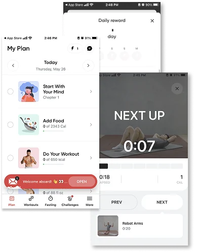
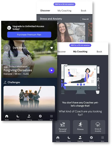
We studied competitor strengths and weaknesses to identify opportunities for improvement, as well as design takeaways. By conducting a competitive analysis, we determined possible features that could help Dooable stay ahead of design trends and the competition.

Screens from a competitor app: a My Plan checklist for the day, a daily reward prompt, and a workout timer reading Next Up.

Competitor 1

Personalized workout and nutrition plans supported by real human coaches, comprehensive progress tracking, and cognitive behavioral therapy based practice tips.

Main design takeaways

  • Long onboarding process
  • Guided lessons and introduction material
  • Quick access to coaches via messaging
  • Bottom navigation
  • Able to decide what areas of health and wellness to focus on
  • Daily reward center and trophies for achievements
  • Easy to follow workout plans
  • FAQ page for quick reference and help on how to user can benefit from their app
Screens from a competitor app in a dark color palette: a meditation home screen with an upgrade banner, and a My Coaching screen asking what kind of coach you are looking for.

Competitor 2

Digital health platform offering hundreds of coaches for 1:1 and group coaching, tools for team wellness such as team challenges, and over 3,000 on demand wellness sessions for holistic well being.

Main design takeaways

  • Short onboarding
  • Dark color palette
  • News feed like home screen
  • Bottom navigation
  • Very pushy with selling sessions
  • Ability to see available sessions for coaches before selecting a coach or committing to a plan
  • Ability to view recorded sessions for individual coaches prior to commitment (try before you buy)
  • Ability to find coaches based on date/time

Personas and journey maps

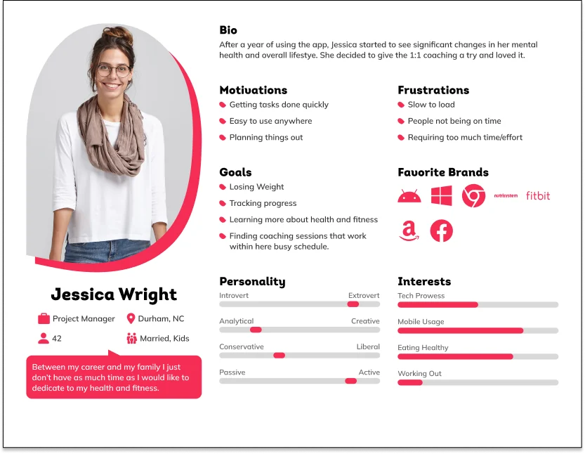
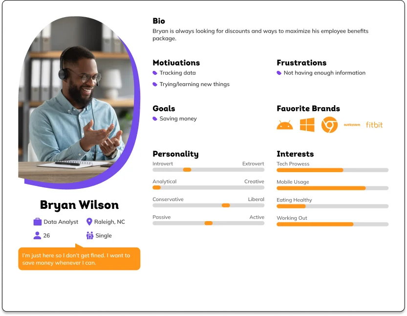
Researching and understanding user motivations is an integral part of designing a successful product. To develop the personas and journey maps, we gathered information about potential customers from interviews with Dooable's health coaches, directors, and key executives. They represent the behaviors, motivators, frustrations, brand preferences, and goals of Dooable's users.

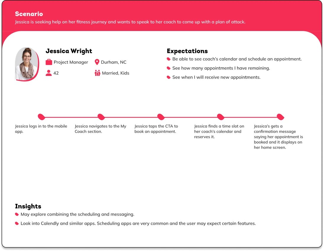
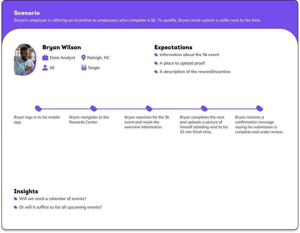
Journey maps depict scenarios and interactions based on user expectations and goals. It helps us understand how the customer will navigate and use the app. We also use them as a guide when redesigning the interface, which informs the decisions we make when creating a product.

Persona card for Jessica Wright, a 42 year old project manager in Durham, NC, with her bio, motivations, frustrations, goals, favorite brands, personality scales, and interests.
Persona: Jessica Wright
Persona card for Bryan Wilson, a 26 year old data analyst in Raleigh, NC, with his bio, motivations, frustrations, goals, favorite brands, personality scales, and interests.
Persona: Bryan Wilson
Journey map for Jessica, who wants to book a coaching appointment, showing five steps from logging in to receiving a confirmation, plus insights about combining scheduling and messaging.
Journey map: booking a coaching session
Journey map for Bryan, who wants to submit proof of a 5k to earn an employer incentive, showing five steps from logging in to receiving a confirmation message.
Journey map: submitting a 5k for an incentive

Audit findings

After completing the UX Audit, we delivered a detailed report with our findings and recommendations. The detailed audit report included actionable steps and insights that were critical in redesigning Dooable's app.

Summary of findings

Onboarding

A noticeable difference between apps is the initial onboarding process. Some apps will ask a ton of questions before you ever see the home screen. Other apps will ask a few things and then you are on your own.

Our suggestion is to land somewhere in the middle: offer an onboarding experience that the user can do at their own pace. This allows new users to gain access to the app to see if it is what they are looking for while also ensuring users that are committed have a path to follow to avoid confusion/pain points down the road.

Color palette

Most of the apps used a light color palette with a clean design style. The light colors evoke a more positive feeling. The one app that does utilize a dark color palette does have a strong focus on sleep. If sleep wellness becomes a focus then it is something that can be considered.

Bottom navigation

All the apps embraced a bottom navigation that offered quick access to the main section with an expandable menu to access additional functionality.

Focus on today

All the apps focus the user on what they need to accomplish today; not distracting the users with other tasks. They also reference the bigger picture or goals for motivational purposes; showing progress or reminding the user what they are aiming to accomplish.

Side scrolling

Most apps utilize side scrolling in their news feeds in order to expose more content to users.

Condensing content

Related to the navigation, instead of having a large number of pages and making the app/site difficult to navigate on a mobile device, most apps condensed content into a small number of pages. The apps then used a variety of design techniques in order to guide the user toward more specific content.

Redesign

Improved product

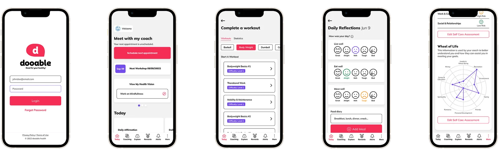
Based on our findings from the UX Audit, we created wireframes and mockups that reflected UX best practices and industry trends. We improved the navigation and created a better onboarding experience for their users. In addition, we simplified data heavy sections and reduced the amount of content on each screen. Utilizing Dooable's established style guide, we introduced light colors and minimal design elements.

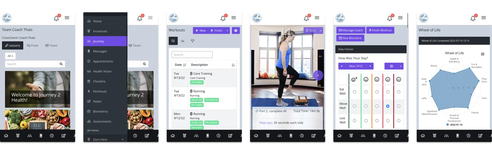
The original app on mobile: a coach page, a navigation menu, a workouts table, a workout video, a daily check-in grid, and a wheel of life chart.
Before redesign
The redesigned app on phones: the login screen, the home screen with a prompt to meet with the coach, a workout list, daily reflections, and a self care assessment.
After redesign

Home screen

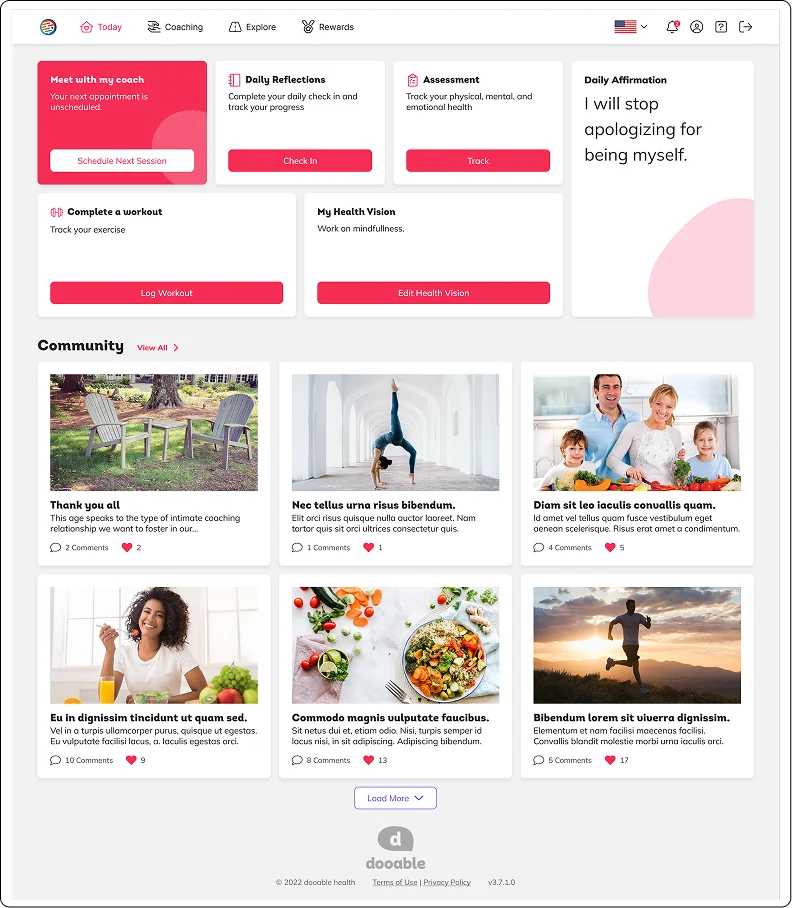
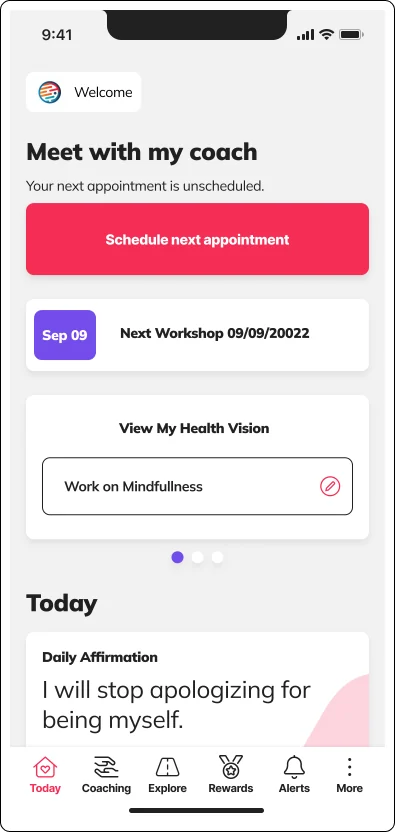
The redesign focused heavily on the home page. Based on user feedback, we opted for a simplified and branded layout emphasizing coaching sessions, which are essential to Dooable's ability to assist clients. We included clear and compelling calls to action to engage users better. Furthermore, we created user-friendly pathways for accessing coaching articles and communicating with their coach.

Redesigned home screen on desktop with a highlighted Meet with my coach card, shortcuts for daily reflections, assessment, workouts and health vision, and a community feed.
Redesigned home screen on mobile with a Meet with my coach card, the next workshop, and a daily affirmation.

Coaching

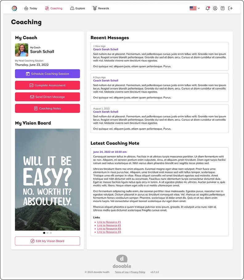
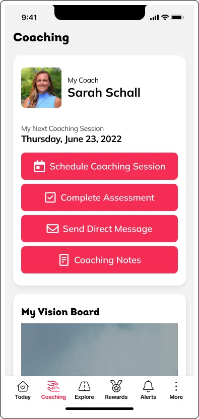
One of the key needs and features of Dooable revolves around the coach's ability to message clients, provide resources, and offer guidance for all employees using the program. When designing the coaching tab, we aimed to centralize all coaching resources in one place. In the original app, resources were scattered, and users had trouble finding where to message their coaches or access notes from previous coaching sessions. In the redesign, we made these tasks easier and eliminated points of frustration.

Redesigned coaching page on desktop with the coach profile, scheduling and messaging buttons, a vision board, recent messages, and the latest coaching note.
Redesigned coaching page on mobile with the coach profile and buttons to schedule a session, complete an assessment, send a message, and open coaching notes.

Explore

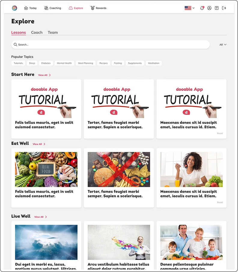
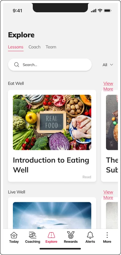
Dooable partners with companies to help employees lead healthier lives. While it is recommended, not all employees want to chat with a live coach. Dooable provides articles and resources that offer life-altering information and are easily accessible to employees. The Explore page allows employees to view lessons, articles, recipes, and global wellness information provided by coaches. The explore page can aid coaches during their sessions, but it can also be freely browsed by employees seeking wellness information.

Redesigned Explore page on desktop with search, popular topic tags, and rows of lesson cards under Start Here, Eat Well, and Live Well.
Redesigned Explore page on mobile with search and a side scrolling row of lesson cards under Eat Well.

Rewards

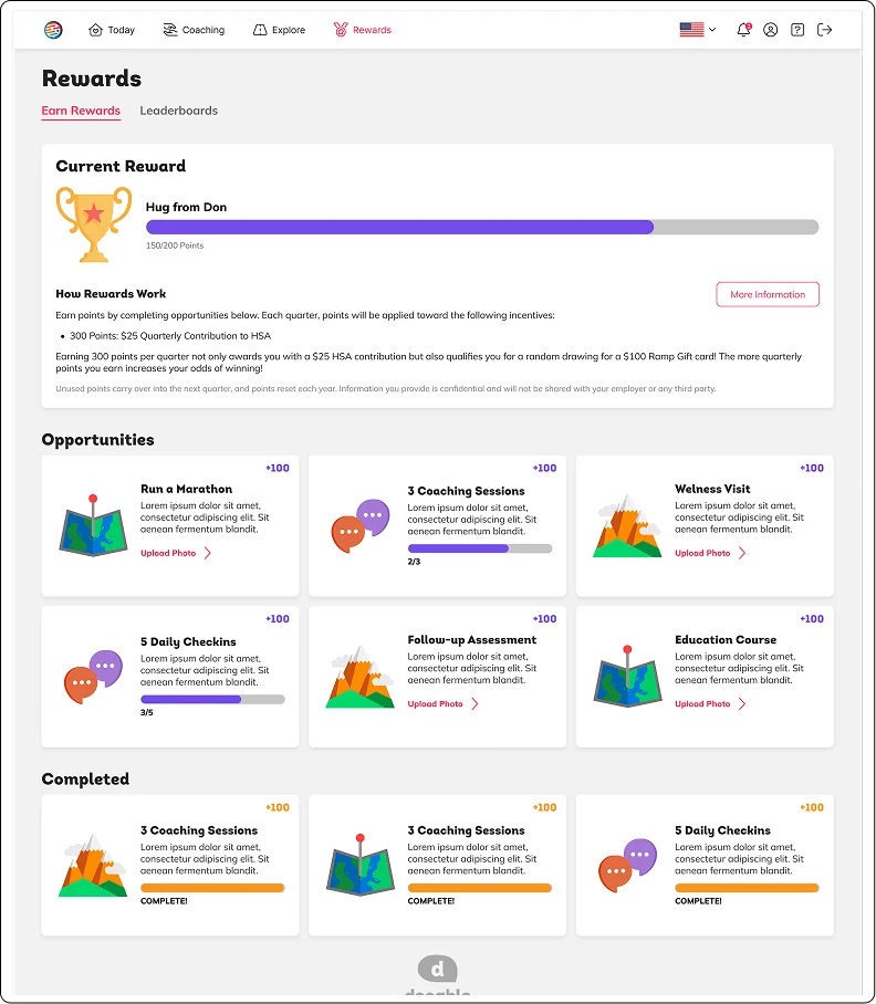
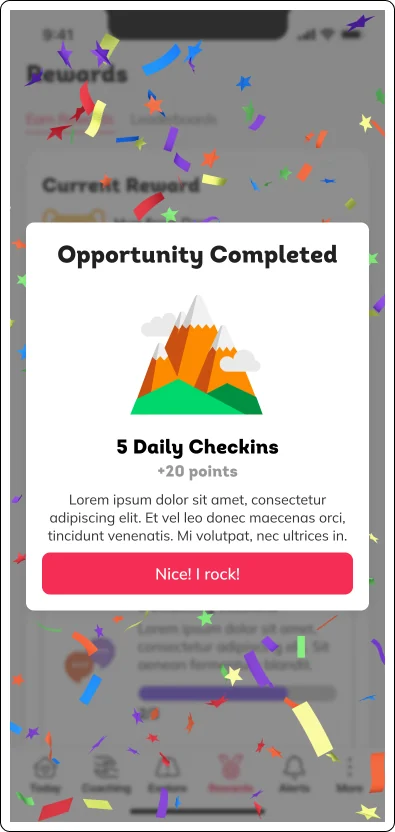
To encourage employees to utilize Dooable's resources, employers can offer rewards such as gift cards, HSA contributions, and reduced insurance payments. However, the original rewards design wasn't very user-friendly. It heavily relied on stock photography and didn't clearly indicate the employees' progress or what they had earned. During the redesign, we made the value of each reward clear. We introduced fun illustrations, vibrant colors, and a confetti animation that provides feedback and adds gamification to the employees' wellness achievements.

Redesigned Rewards page on desktop with a progress bar toward the current reward, point opportunities with illustrations, and completed opportunities.
Rewards on mobile with a confetti celebration card reading Opportunity Completed for 5 Daily Checkins.

Assessments

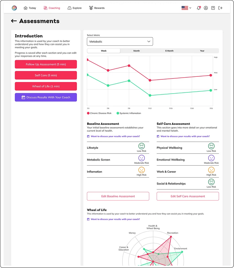
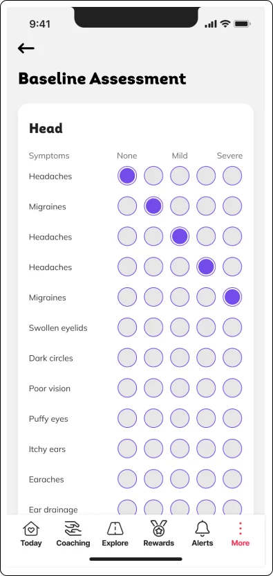
Assessments and data visualization were critical in helping employees and coaches understand their wellness progress. The old designs did not inform the users how long the assessments would take or how many there were; the charts only had numbers and weren't mobile-friendly. We used drop-downs to condense heavy information, added time to show the users how little effort was required to complete the assessment, and provided informative data visualizations.

Redesigned Assessments page on desktop with timed assessment buttons, a line chart of risk over time, risk levels by section, and a wheel of life chart.
Baseline Assessment on mobile with a grid of symptoms rated from none to severe.

Thank you