All work

Genesis Juror Portal

Role
Product Designer, research and design
Product
Genesis, powered by Judicial Systems, Inc
Focus
Public-facing juror experience
Deliverable
Minimal Desirable Product (MDP)
Genesis logo, a white column icon beside the word GENESIS with the line Powered by Judicial Systems, Inc, over a blue tinted photo of a courthouse.

Introduction

The Genesis Juror Portal is a secure, web-based platform that provides 24-hour access for jurors to manage their civic responsibilities. From verifying addresses to requesting excuses or deferrals, the portal is designed to help jurors help themselves, anytime, from any device.

My role focused on redesigning the public-facing experience, with the goal of delivering a Minimal Desirable Product (MDP) that could be implemented quickly while significantly improving usability, accessibility, and user confidence.

UX enhancements

After conducting a UX audit, I identified four key opportunities to make the juror experience more user-friendly:

Navigation clarity

It was often unclear where users were in the portal. The navigation didn't highlight the current page, and the page titles weren't very helpful. To fix this, I suggested adding clear tabs or step-by-step guides to help users know where they are and what to do next.
Content overload

Users were hit with too much information at once, which made the experience feel overwhelming. I worked on simplifying the layout by removing unnecessary content and guiding users toward the most important actions, so they could complete tasks more easily and confidently.

Mobile responsiveness

A lot of users access the portal on their phones, but the design didn't always work on smaller screens. I proposed a more flexible layout using containers and a grid system to make sure everything looked clean and worked well on any device.

Visual design and UI

The portal needed a more modern, accessible look. I updated font sizes for better readability, improved the visual hierarchy, and brought the design more in line with Genesis marketing and branding, while keeping things flexible so different courts could still customize the look as needed.

Flow map

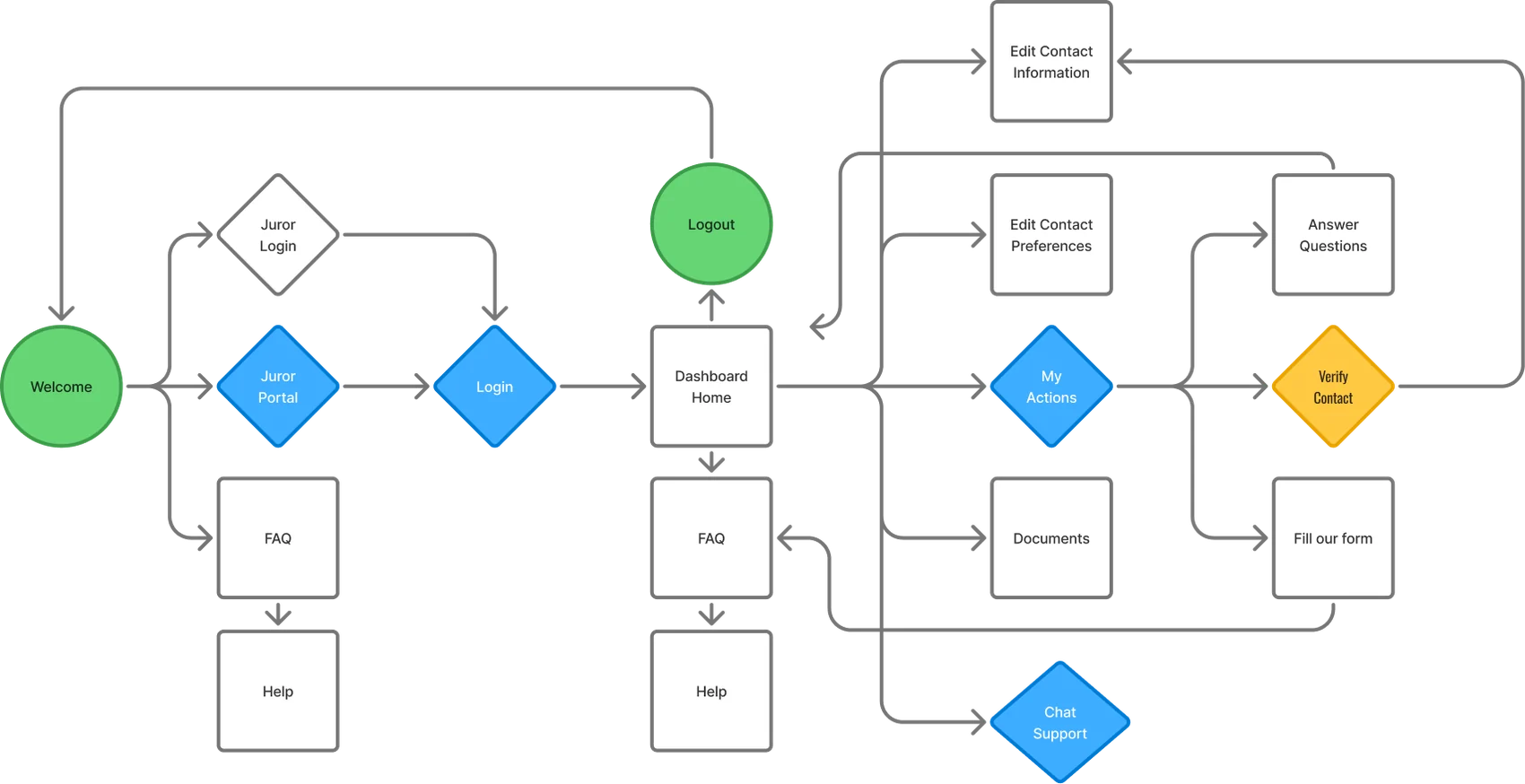
Before starting design, it was important for me to fully understand how the application worked from start to finish. To do that, I mapped out the entire user flow, identifying key entry points and decision paths. This flow map helped me see the big picture and ensure that the redesigned experience would feel logical and intuitive for jurors.

Flow map of the juror portal. From Welcome, users go to the FAQ, Juror Login, or Juror Portal, then log in to the Dashboard Home. From there they reach FAQ and Help, My Actions, Edit Contact Information, Edit Contact Preferences, Documents, Chat Support, and Logout. My Actions leads to Verify Contact, Answer Questions, and Fill our form.
Flow map

Design

With a clear understanding of the user flow and key pain points, I moved into the design phase with a focus on simplicity, clarity, and accessibility. I began by sketching low-fidelity wireframes to explore layout options and content hierarchy, keeping the user's journey front and center. From there, I developed high-fidelity mockups that applied updated visual styles aligned with Genesis branding, while allowing room for white-label customization.

Throughout the process, I prioritized clean navigation, reduced cognitive load, and responsive design to ensure a smooth experience across devices. Each screen was carefully crafted to help jurors complete tasks confidently and without confusion.

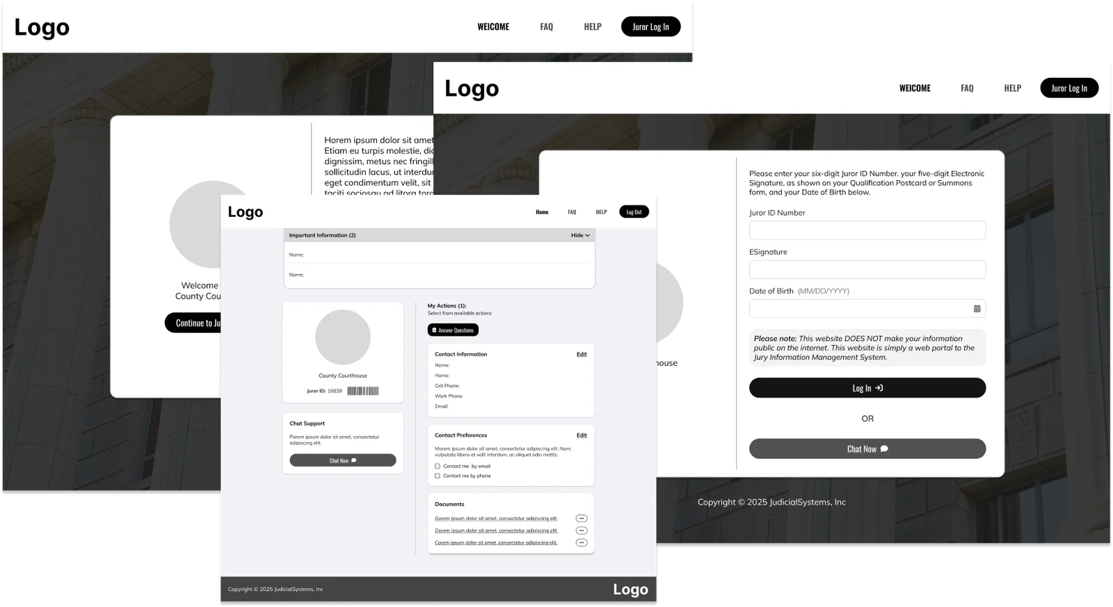
Low fidelity wireframes of the welcome, login, and juror dashboard screens in grayscale, with placeholder logos.
Low-fidelity wireframes
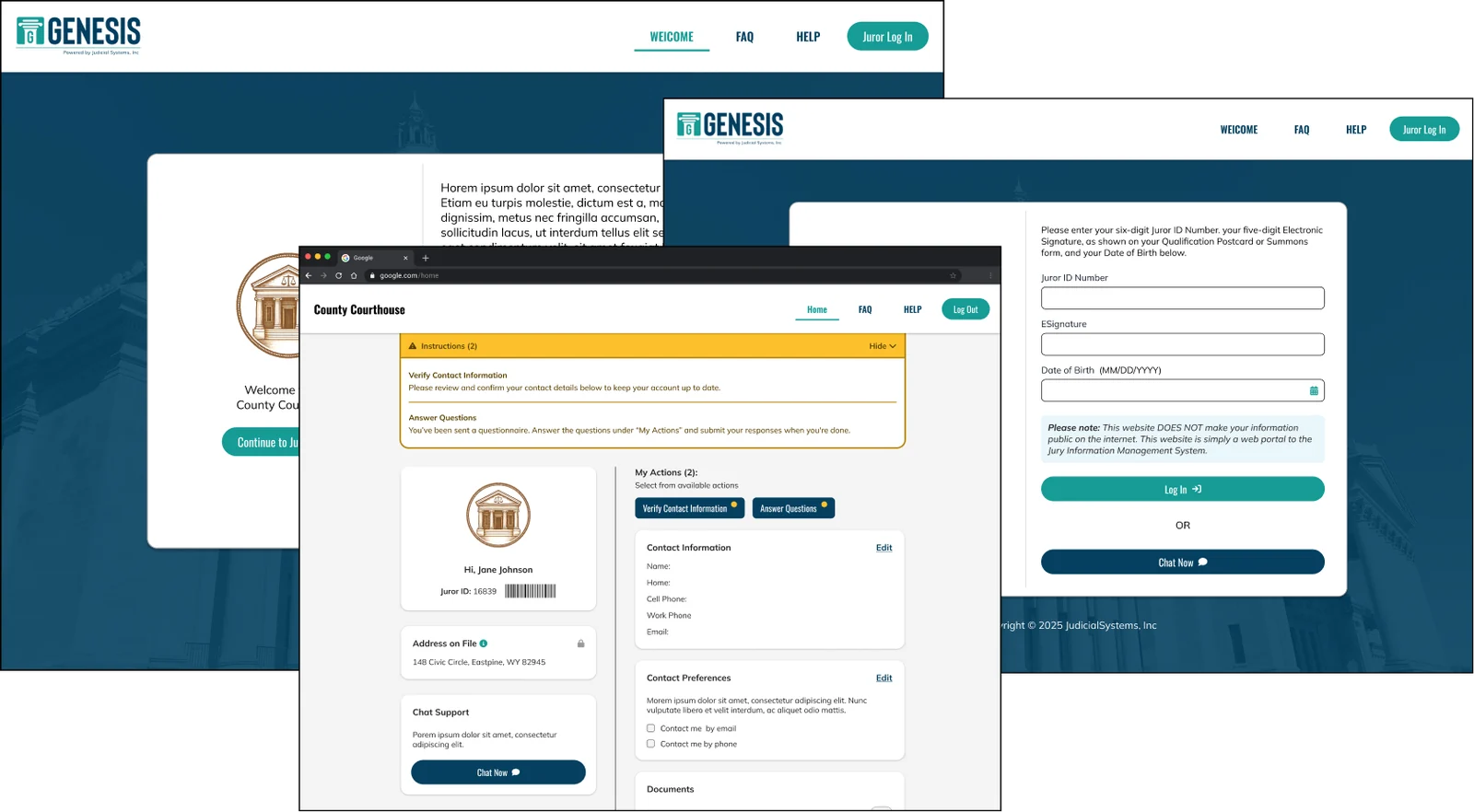
High fidelity mockups of the welcome, login, and juror dashboard screens in Genesis blue and teal.
High-fidelity mockups
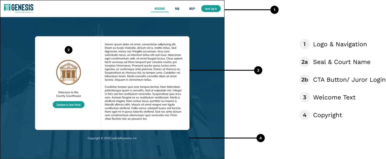
Welcome screen with callouts: logo and navigation, seal and court name, a Continue to Juror Portal button, welcome text, and copyright.
Welcome screen
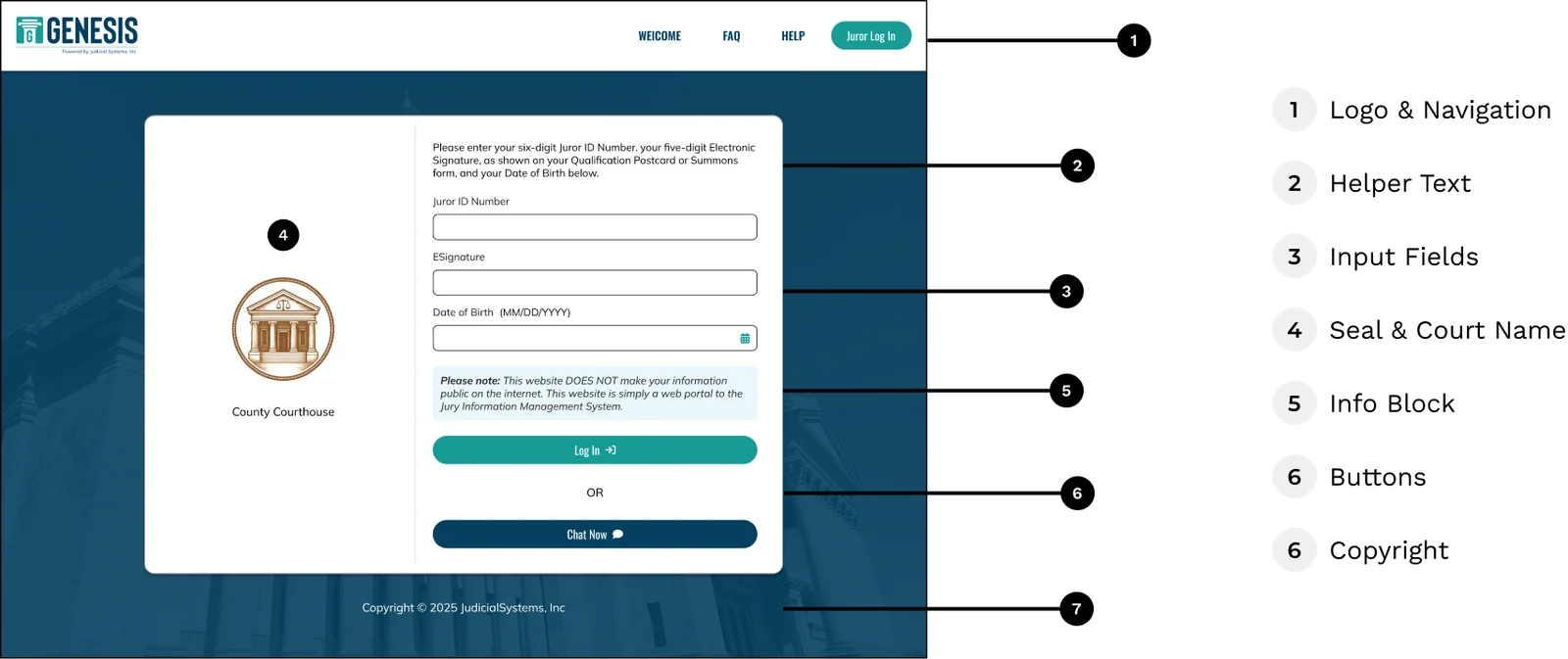
Login screen with callouts: logo and navigation, helper text, input fields for Juror ID, ESignature, and date of birth, seal and court name, an info block, buttons, and copyright.
Login screen
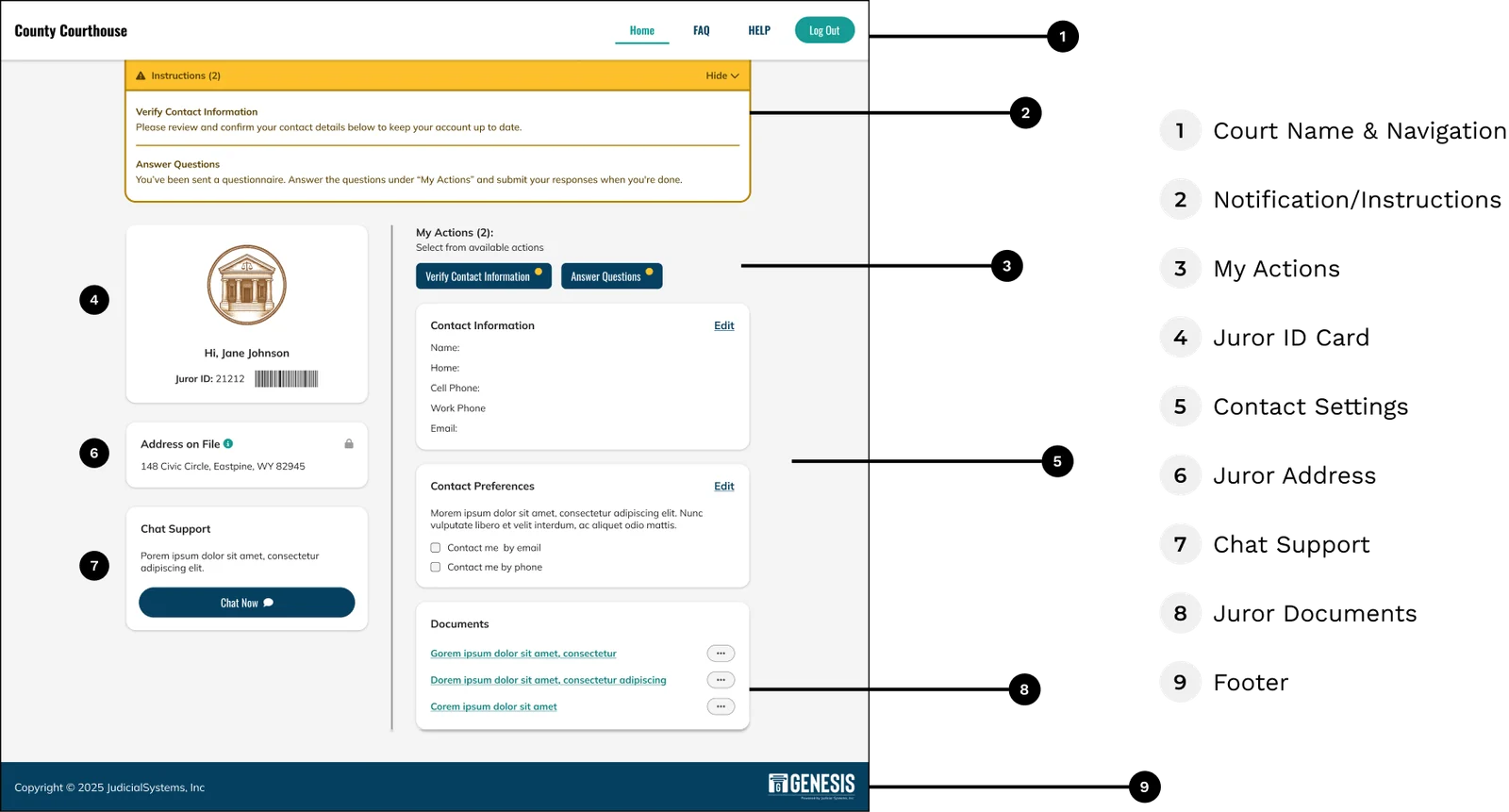
Juror dashboard with callouts: court name and navigation, instructions, My Actions, juror ID card, contact settings, address, chat support, documents, and footer.
Juror dashboard
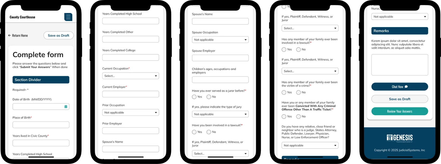
Five phone screens showing a long Complete form questionnaire with text fields, dropdowns, radio buttons, a remarks box, and buttons to save as draft or review answers.
Questionnaire on mobile
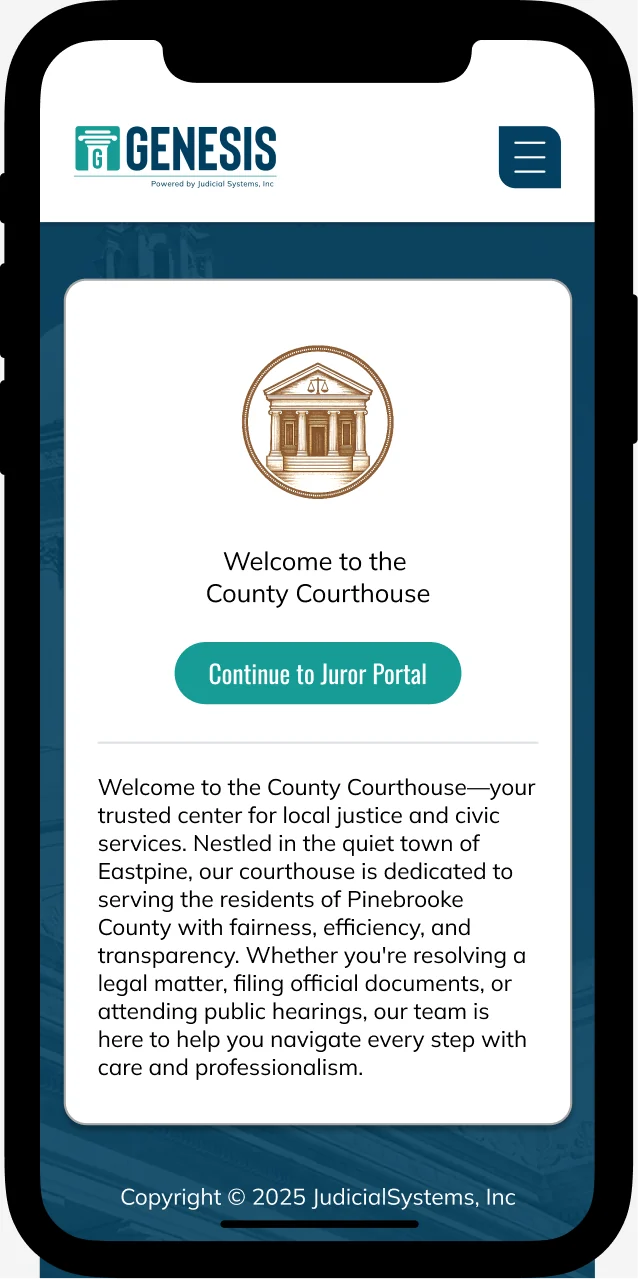
Welcome screen on a phone with the court seal, a Continue to Juror Portal button, and welcome text.
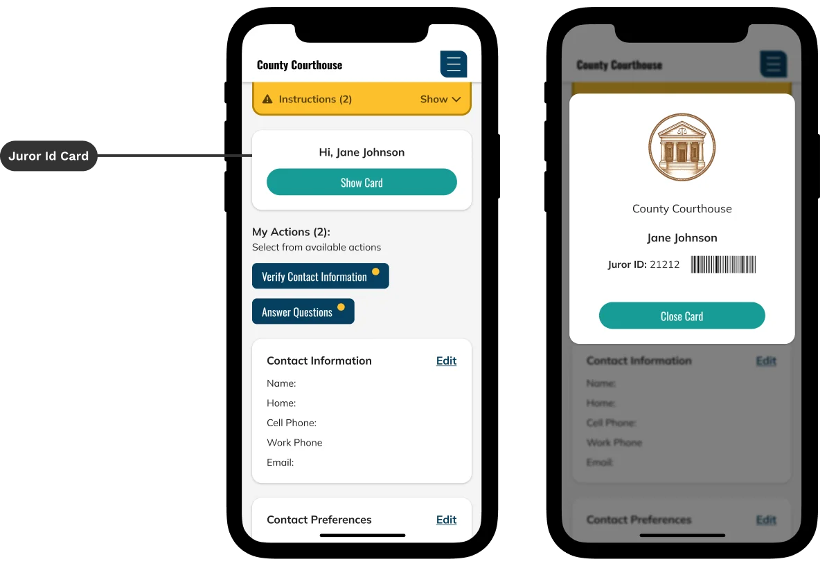
Dashboard on a phone with a Show Card button for the juror ID card, next to the card opened as a modal with the court seal, juror name, juror ID, and barcode.
Juror ID card on mobile

UI characteristics

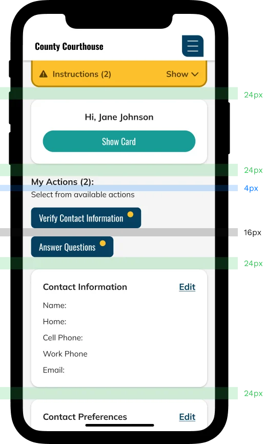
4-point grid system

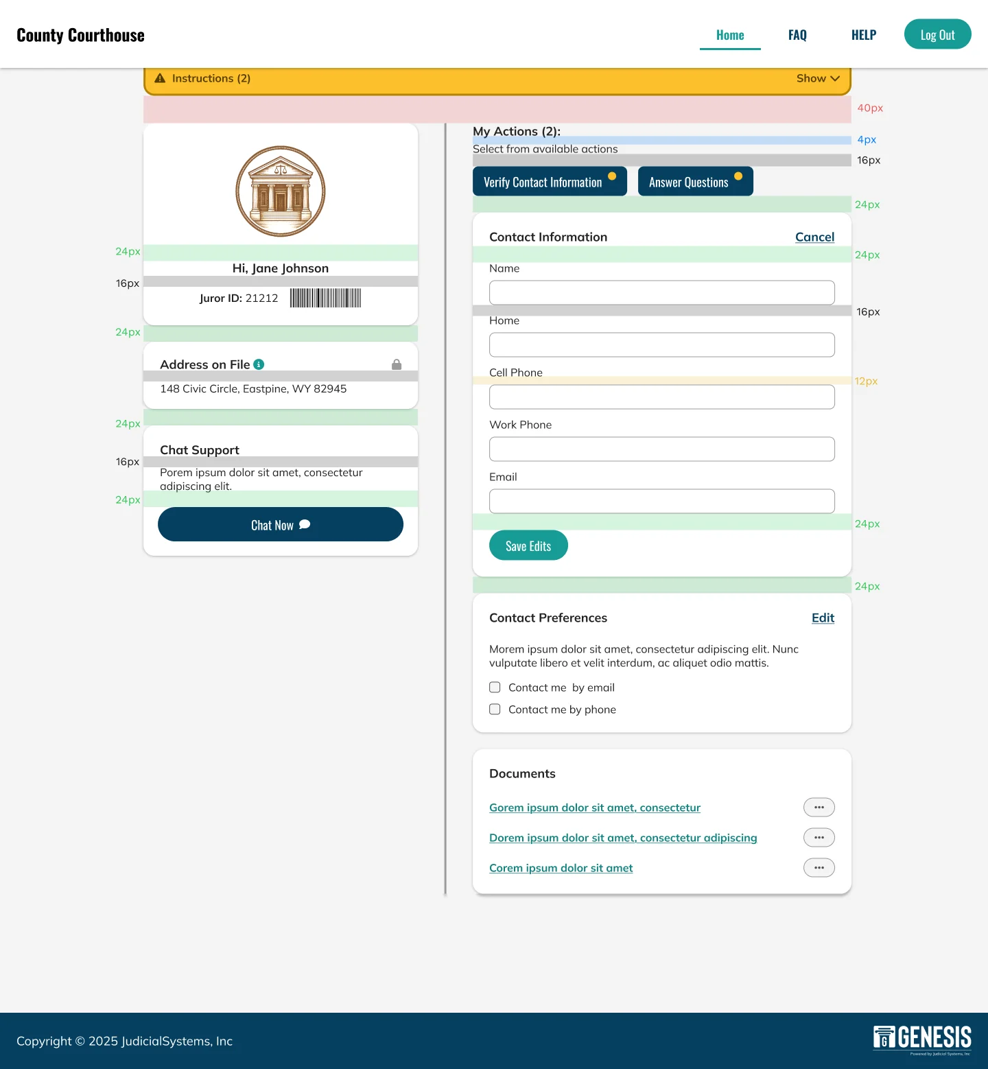
To ensure consistency and scalability, I used a 4-point spacing system throughout the design. This approach applies spacing in 4px increments (e.g., 4, 8, 12, 16, 24, 32…), creating a flexible yet structured layout across components and screen sizes.

Smaller elements like button padding or icon spacing use values such as 8px or 12px, while larger sections, like content blocks, use 24px or 32px. This system helps maintain visual rhythm and balance, while also making the design easier to scale and adapt for different layouts.

Juror dashboard on desktop with colored bands marking spacing values such as 4, 12, 16, 24, and 40 pixels between elements.
Juror dashboard on a phone with colored bands marking 4, 16, and 24 pixel spacing.

Typography

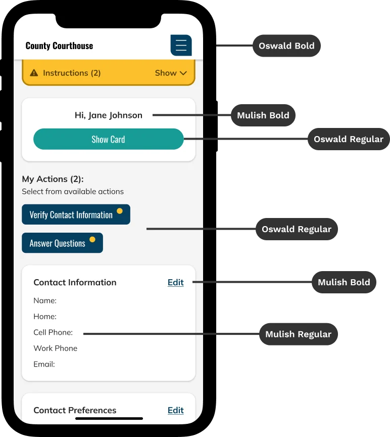
To support accessibility and maintain a comfortable reading experience, I set a minimum base font size of 16px throughout the design. This ensures that content is legible across a wide range of devices and for users with varying visual needs. Font sizes below 14px were intentionally avoided, with 14px reserved only for secondary elements like captions, fine-print labels, or interaction-heavy interfaces where space is limited.

By following these standards, the design remains inclusive, readable, and user-centered, promoting usability for all.

  • Mulish: clean and modern, used for body text and general UI
  • Oswald: used sparingly for headings or as a bold alternative
Juror dashboard on a phone with labels naming the fonts: Oswald Bold for the court name, Mulish Bold for the greeting and section titles, Oswald Regular for buttons, and Mulish Regular for body text.

Components

Input fields

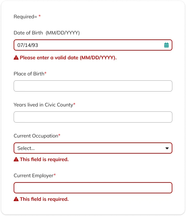
When designing forms, clarity and consistency are essential. Labels should be clear, consistently styled, and indicate required fields. Placing labels above inputs improves readability and responsiveness across devices. To support usability, I also recommended adding inline validation and real-time error messages to help users correct issues quickly and confidently.

Form with labels above each field and a required marker. Fields with errors have a red border and a message, such as Please enter a valid date and This field is required.

Instructions

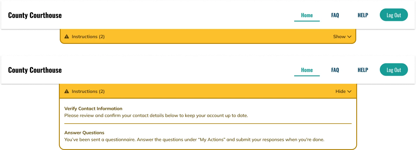
The Instructions/Notifications dropdown provides jurors with key information and guidance throughout the process. To reduce clutter and support focus, users can easily expand or collapse the section as needed, keeping important details accessible without overwhelming the interface.

Amber Instructions banner shown collapsed with a Show button, and expanded with a Hide button revealing two instructions: Verify Contact Information and Answer Questions.

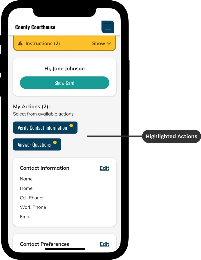
Highlighted actions

The My Actions section highlights tasks that require the juror's attention. When an action is needed, an amber notification dot appears, signaling that something must be completed. To keep the interface focused and user-friendly, only relevant and available actions are shown, never options the user can't take. This helps streamline decision-making and reduces confusion.

Phone dashboard with My Actions buttons, Verify Contact Information and Answer Questions, each with an amber dot, labeled Highlighted Actions.

Conclusion

Redesigning the Genesis Juror Portal was an opportunity to simplify a complex process and make jury duty more approachable for everyday users. By focusing on clarity, accessibility, and responsiveness, I created a more intuitive experience that helps jurors confidently complete their tasks with minimal friction. From improving navigation and reducing content overload to refining form usability and modernizing the UI, each design decision was grounded in empathy and usability best practices. The result is a scalable, flexible interface that supports both the needs of the public and the customization goals of individual court systems, bringing clarity and trust to an essential civic process.

Thank you